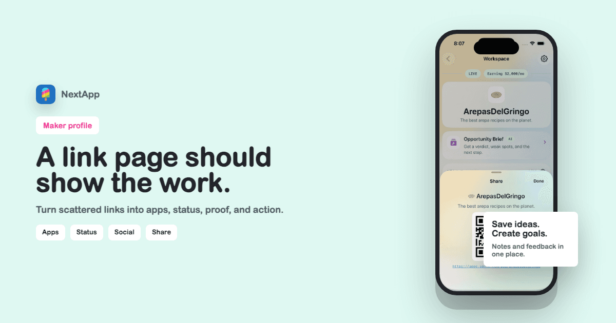
A normal link-in-bio page is good at holding links. It is bad at explaining products. Makers need more context: app status, short descriptions, revenue goals, screenshots, and the reason each link matters.
The better alternative is a public maker profile. It still gives visitors a clean set of destinations, but it wraps those links in the story of what you are building.
A maker link page should explain what the links are, not just where they go.
Links without context waste attention
When someone clicks from X, GitHub, Product Hunt, or a launch post, they are usually trying to understand the builder. A row of links makes them do the sorting themselves.
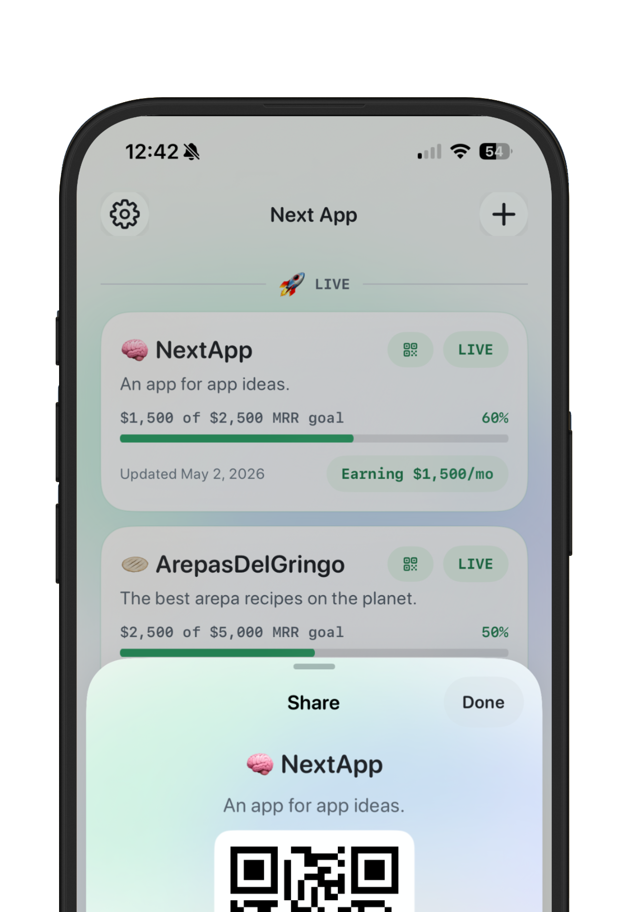
Apps need status
A live app, beta app, waitlist, stealth idea, acquired project, and sunset project should not look identical. Status helps visitors understand what they are looking at.
Revenue and goals belong near the app
If you share MRR, put it where it has meaning. A total number is useful, but app-level revenue and goals tell a better product story.
Keep social links, but stop making them the whole page
Social icons are useful once the visitor understands you. The maker profile should lead with the work, then give people ways to follow, contact, or share.
Maker link-in-bio checklist
- App links have names, descriptions, and statuses.
- The page has one primary CTA.
- Social icons are deduped and secondary.
- Public revenue or goals are intentional.
- The profile can be shared with a readable preview image.
Keep going with maker profile builder, profile page examples, public maker page.